Caniné & Co.
A boutique dog daycare brand concept, built around a quieter, more considered look.
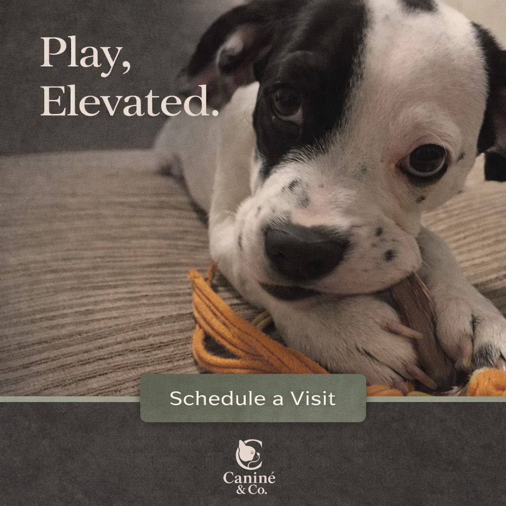
The idea.
I wanted to explore a dog daycare identity that felt warm and premium without relying on bright pet-store colours. Soft neutrals, muted green and a serif wordmark set the direction.
The test was whether that same character could hold together across a website, an inbox and everyday objects. These are concept designs and mockups, not evidence of a launched business or produced merchandise.
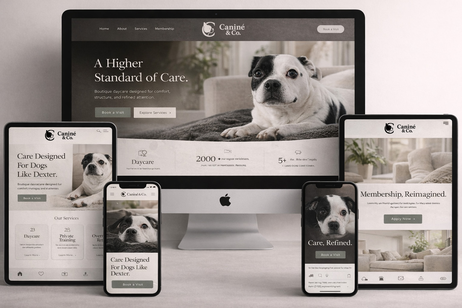
The identity, online.
The dog symbol and wordmark carry into a website concept with the same palette and tone.
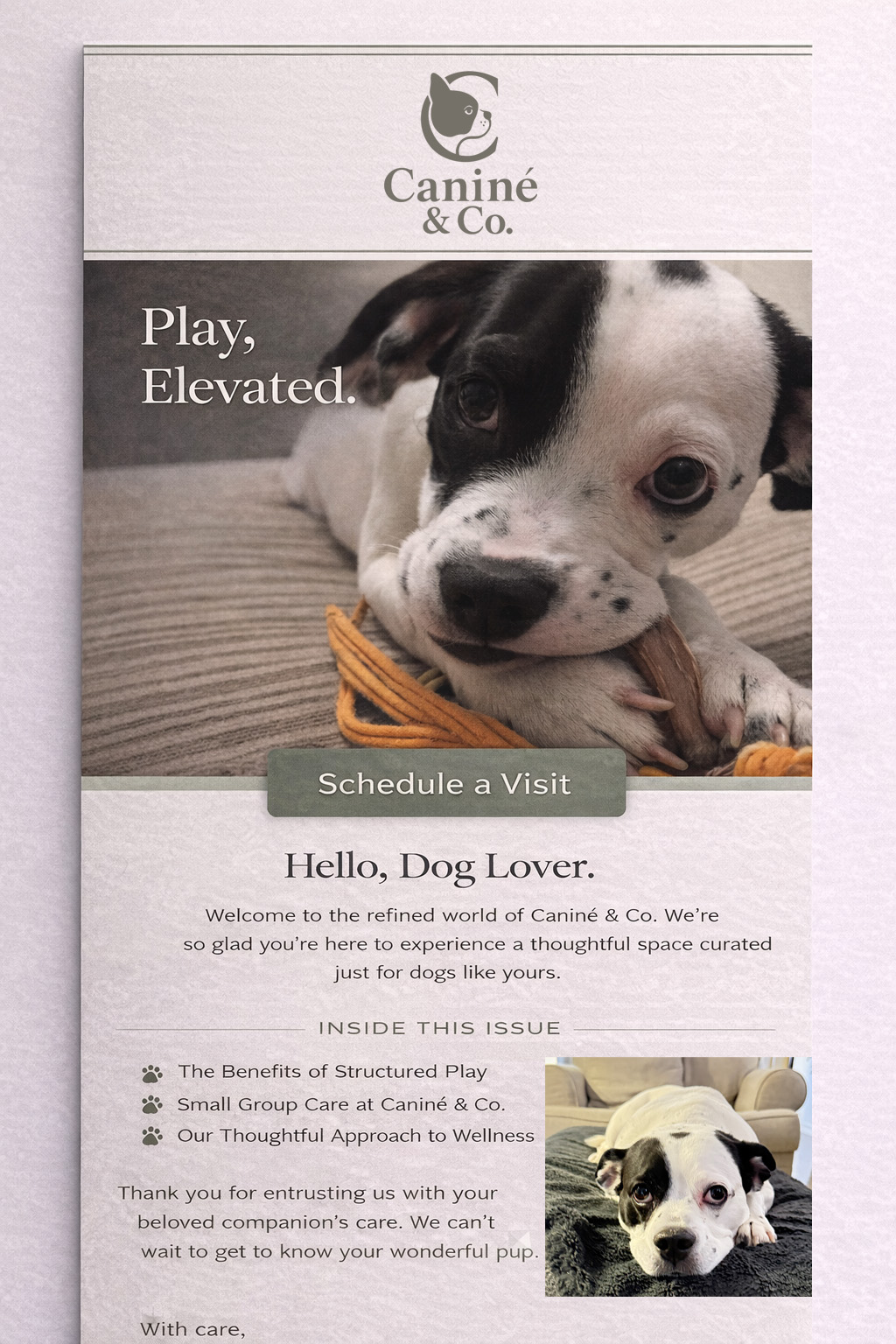
From the feed to the inbox.
Photography carries the message. The type, colour and logo keep each format connected to the brand.
Beyond the screen.
The identity applied to apparel and accessories. Each mockup explores how the mark works at a different scale.