
Offshore Courts
Brand identity, apparel, and a brand book for a floating sports court platform. The visuals place the product in a waterfront setting and extend its identity into clothing and partner materials.
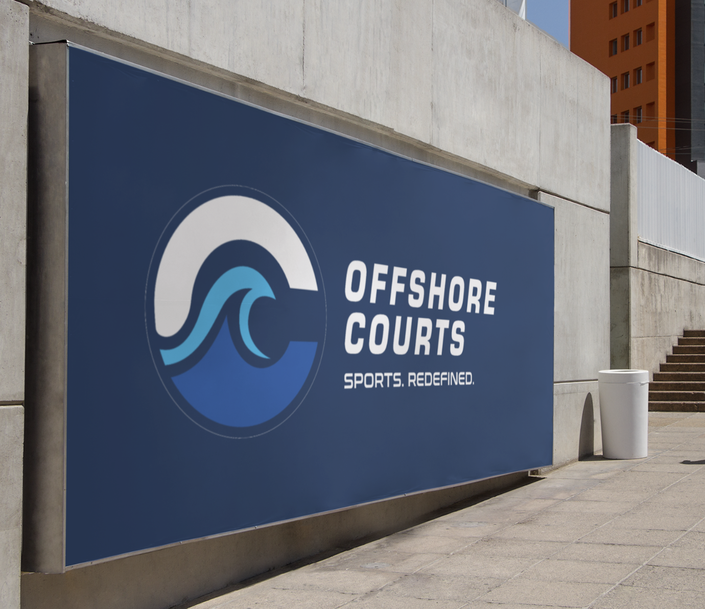
The brief.
Offshore needed a brand for a product category most people had never seen. It had to feel athletic enough for players and considered enough for waterfront destinations and potential partners.
My role covered the identity, visual system, court render compositions, apparel concepts, brand book, and investor presentation materials. The physical court platform and its installation are Offshore Courts’ work.
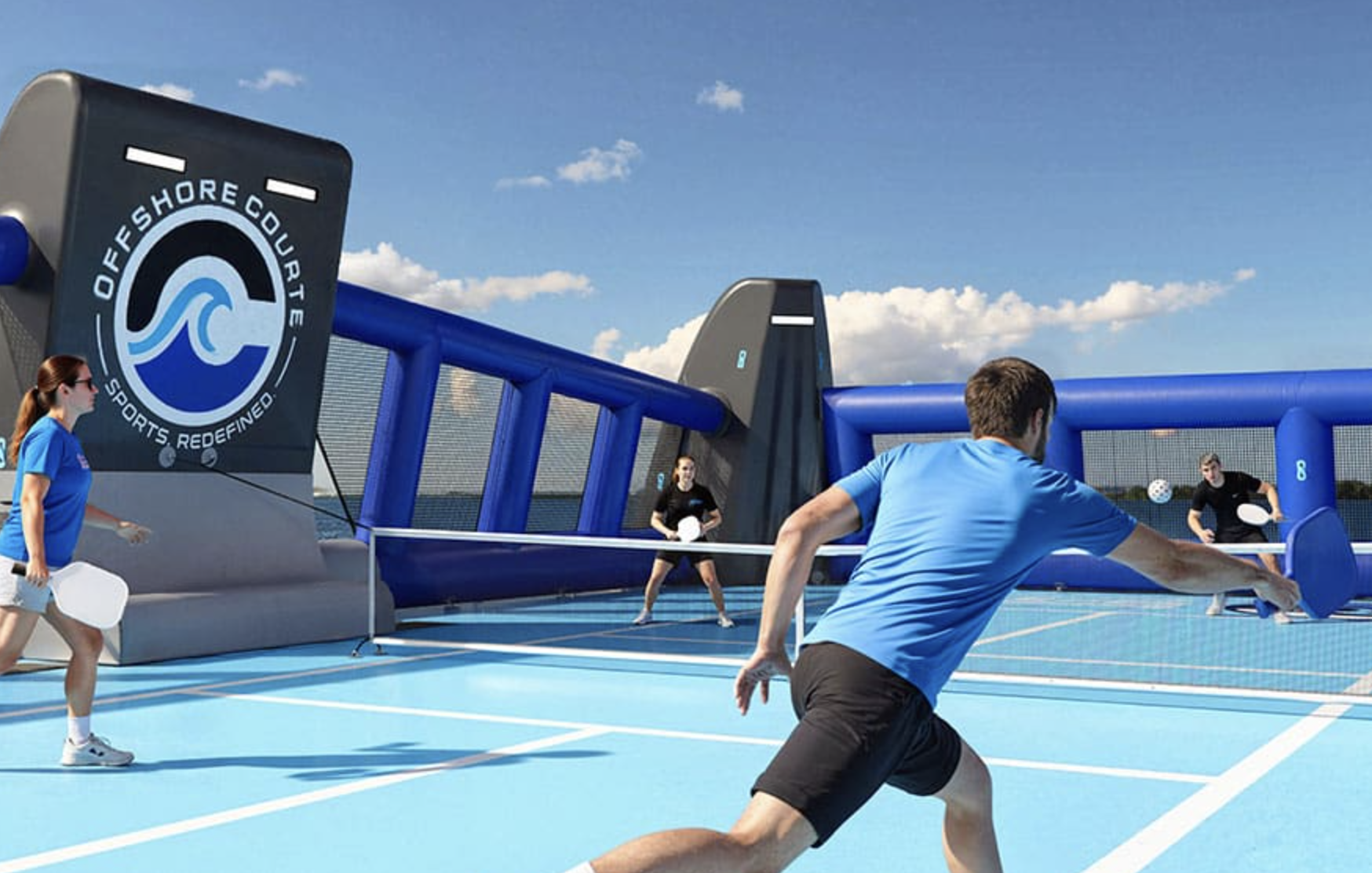
The court in context.
The court visualizations give an unfamiliar product a setting. These are concept renders, not installation photographs.

View the other court concepts

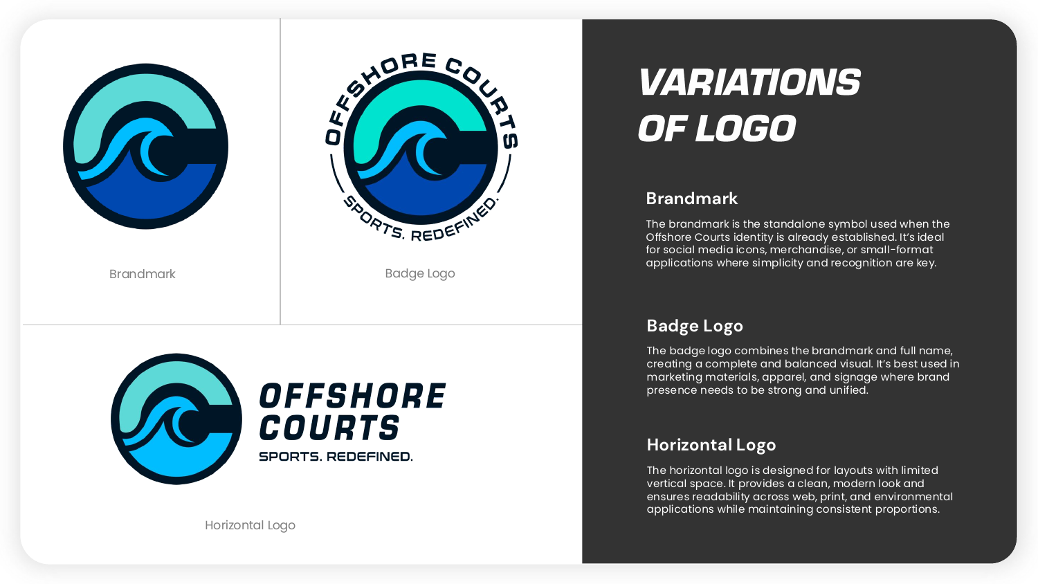
A flexible logo system.
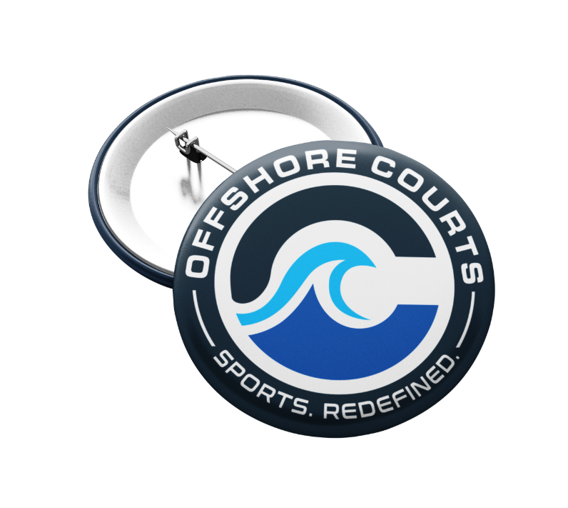
A compact badge for small applications. A horizontal lockup where space is wide. A shared palette to keep both recognizable.
View the individual marks

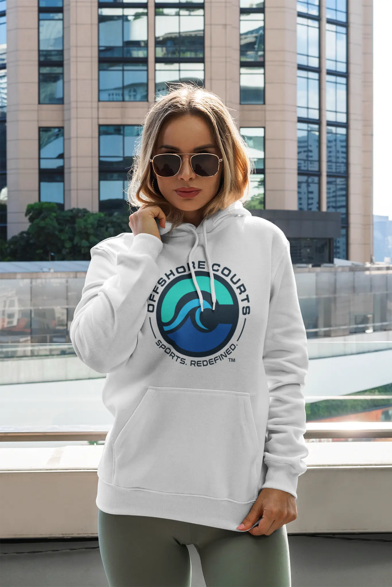
Apparel concepts.
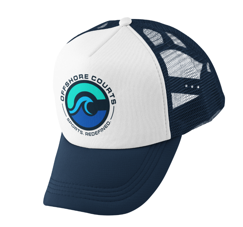
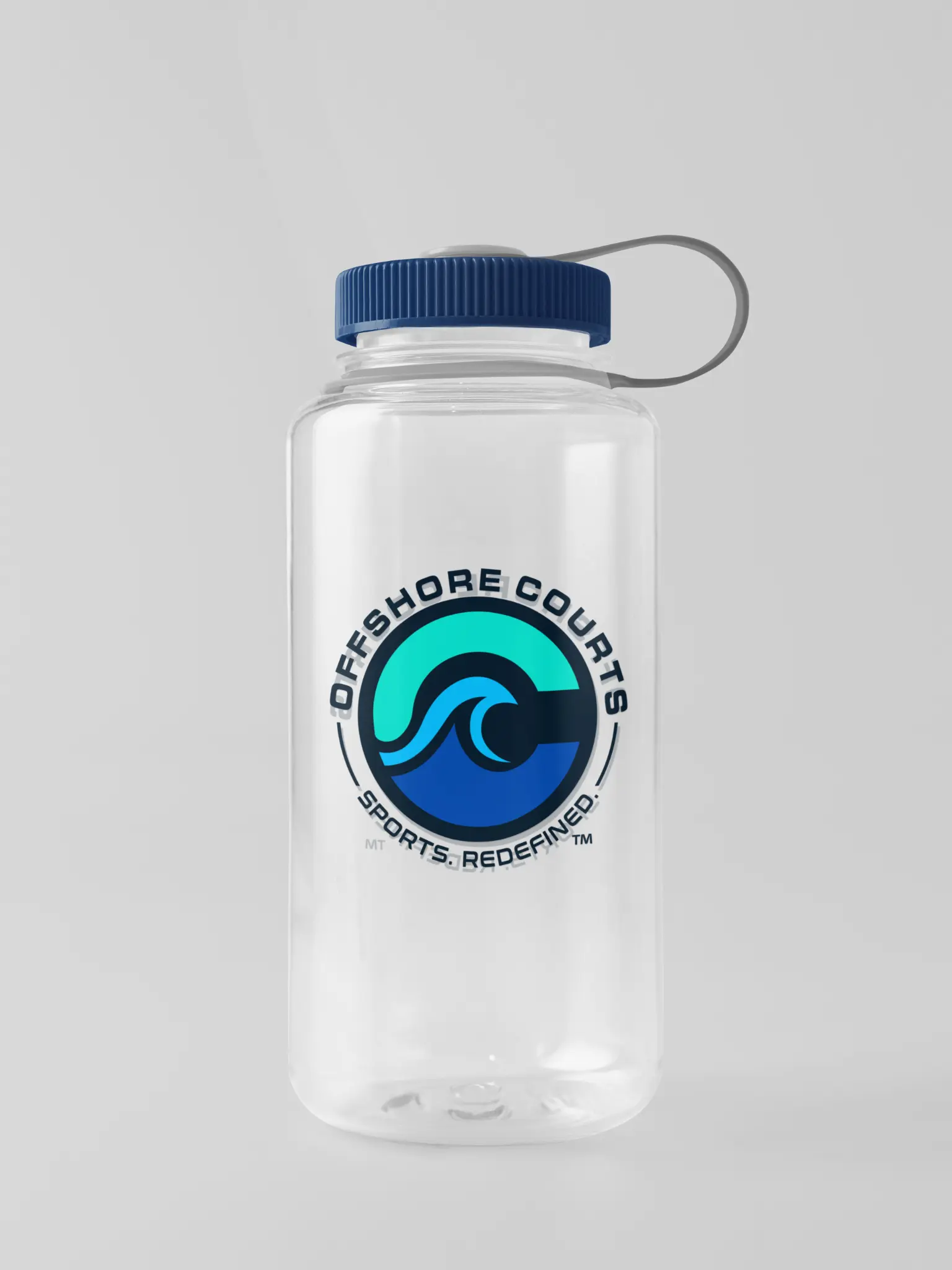
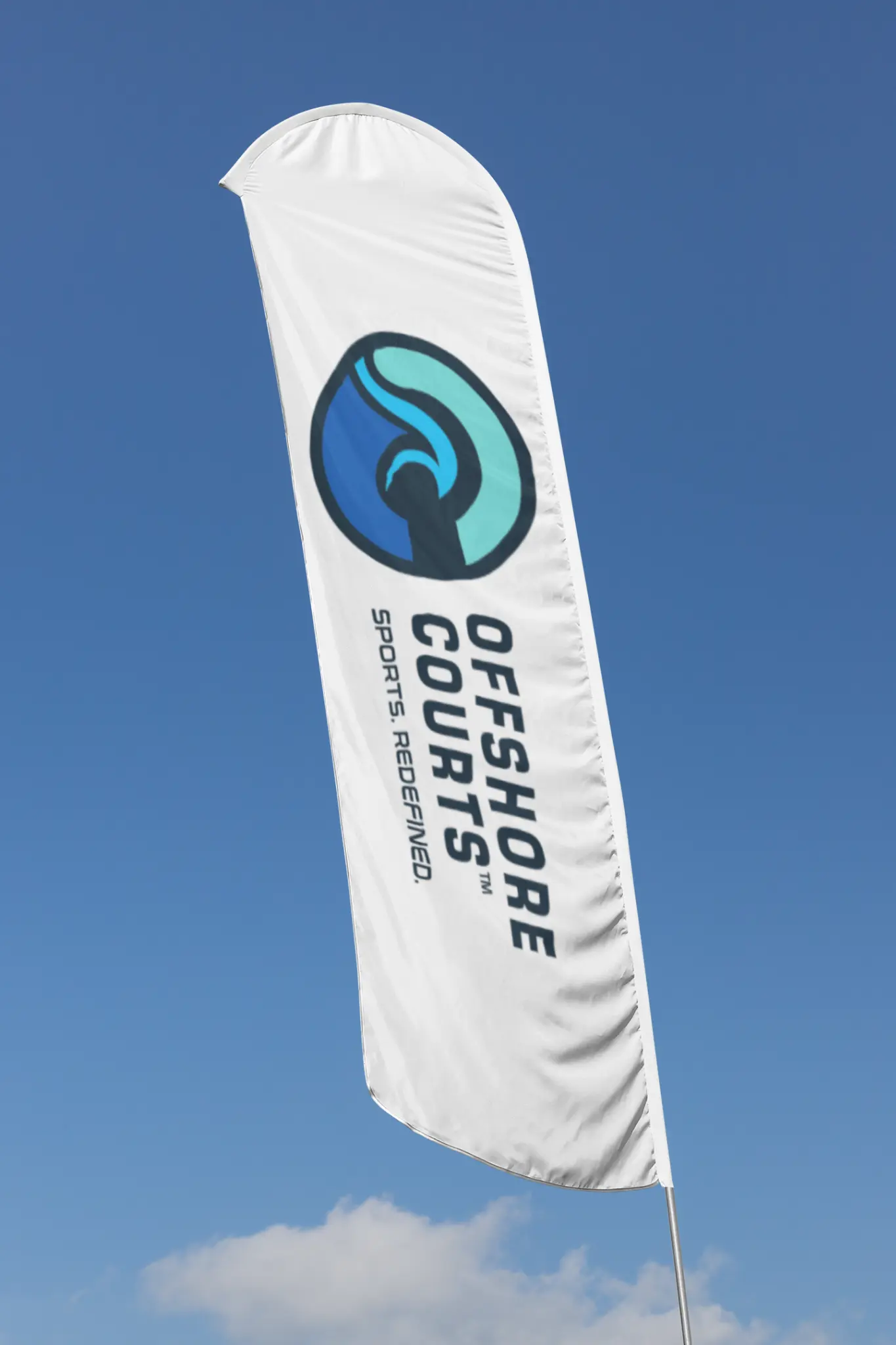
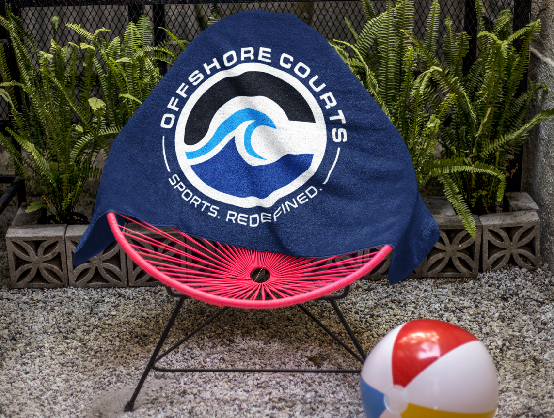
Apparel and merchandise concepts extend the same identity beyond the platform.
View all merchandise concepts
Explore the brand book
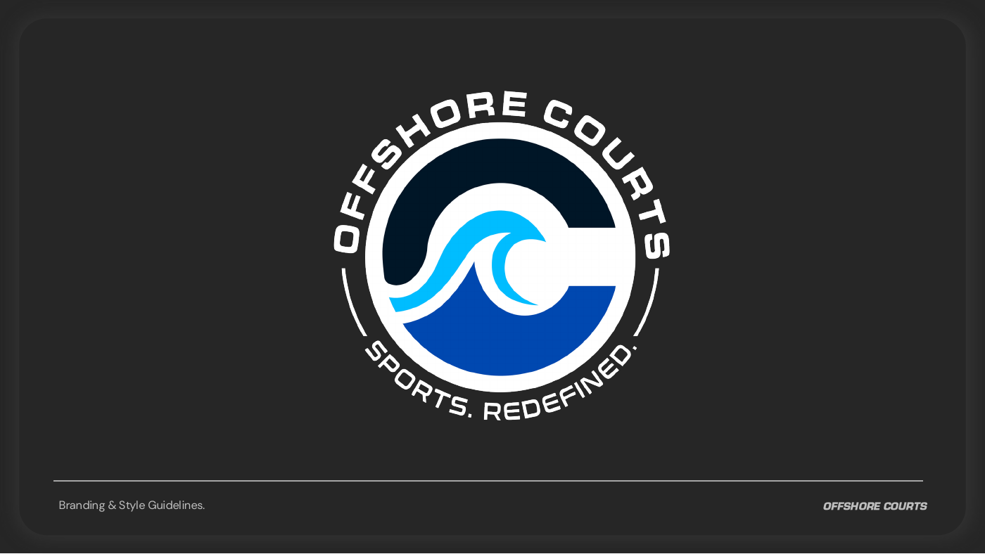
Offshore brand book
Logo variations, colour specifications, typography and usage guidance in one document.
Open brand bookThe design decisions.
The wave inside the OC monogram connects the mark to the water. The badge gives it a compact shape for headwear and merchandise; the horizontal lockup gives the name room on wider applications.
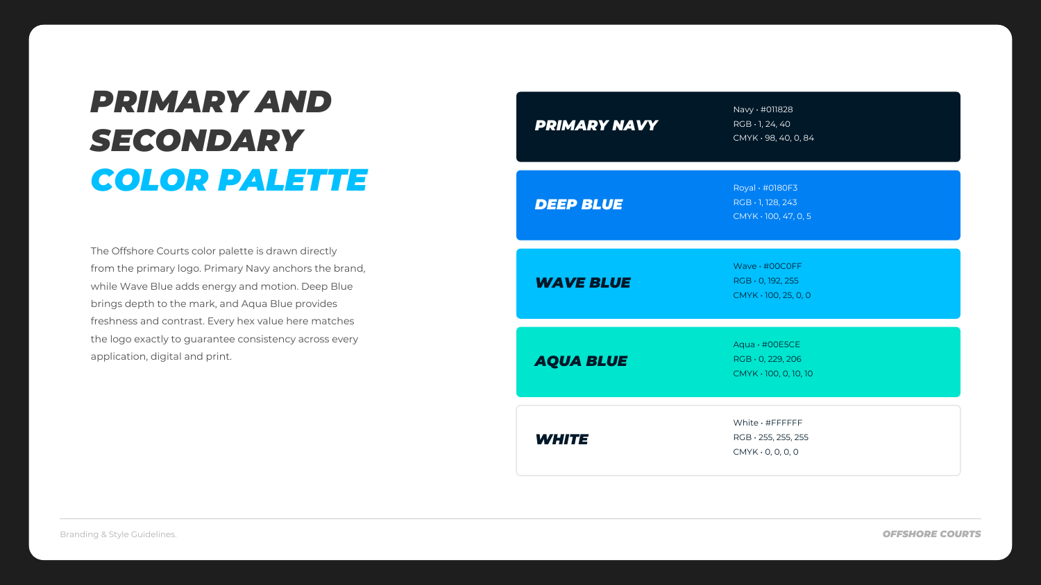
Navy anchors the palette, with brighter blues and aqua carrying the waterfront connection. The guidelines document those choices so the court visuals and apparel concepts stay related.
What the system enables.
The identity, court visuals and brand book give Offshore a consistent set of materials for introducing the platform. The renders and merchandise shown here are design visualizations, not installation photographs.
In their words.
Reid StekelOffshore Courts
“Bryan's conscientiousness and professionalism were invaluable for us to rebrand our company. The experience was truly a cooperative one that far exceeded our expectations. I fully and unequivocally recommend his services.”